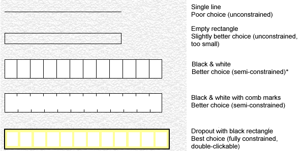
Below are some common character field designs. Ideally, all handwritten alphabetic and numeric fields should be "constrained" to discourage respondents from connecting characters together. That is, they should have one clear area per character to be filled in, such as in the last two examples.

* In the third example, you could double-click each small box in the field, but this would have two disadvantages:
With comma separation in the output, there would be commas between each character.
Validation of the field as a whole would not be possible.
Note: Even better interpretation can be achieved with semi- and fully constrained and fields if you select the Fixed character width option in the field definitions for these fields.
Try to guide the respondent and make it difficult to add odd information and characters. The field designs below do that.

In this field, the dollar sign, comma, decimal, and even zeros are preprinted.

This design is even better because there are fewer exclusion rectangles in the field definition and because you can select as an option in the field definition.

In this field, DDMMYY is printed in a dropout color that is not detected by the scanner.
For more information, see Effective Form Design. (Nothing happens when I click the link.)