The work area for forms
When you open input forms, the work area is divided into three panes: , , and . These are described below.
The toolbar buttons are described here.
Controls pane
The pane shows icons for that you can add to the
form you created.
Drag the desired control into the
pane.
These controls are available:
: Used for grouping
other controls. Grouping gives users a logical visual orientation
aid. ( Information
about its settings.)
Information
about its settings.)
|
| Background color of the control. |
| Determines whether the control reacts to user interaction. |
| Font of the control. |
| Foreground color of the control. |
| Display name of the control. |
| Determines whether the control and its subordinate controls are displayed. |
|
| The name of the control. Read only. |
|
| Determines how the size of the control is changed automatically whenever the size or position of its parent control is changed. |
| Coordinates of the top left corner in the container. |
| The position of the control in the tab order. |
| Size of the control (width; height). |
: Allows users to type
text. (Information
about its settings.)
|
| Determines whether operators are permitted to select
> during Verification.
Tip: You can configure this
property for multiple fields at once by selecting
> .
|
| The number of decimal positions
after the decimal character. Only available when = . |
| Default value. This value is
inserted on document loading if the field is empty. |
| Assigned XBOUND field. (Adjust this first.) |
| Determines how to proceed with
invalid characters during FixForm
processing. Only available when
= or . |
| The display format of the value,
for example dd.mm.yyyy or 0.00. Only available when =
or . |
| Determines which master data
query is assigned to the control. For information about configuring a query, see Creating
and testing a database query. |
| Maximum input length. |
| The data type – ,
,
or . Note: The is determined by the XBOUND
field that the control is assigned to (the
property). The in
turn affects which other properties are available. |
|
| Determines whether the control reacts to user interaction. (Compare with below.) |
| Font of the control. |
| Foreground color of the control. |
| Display name of the control. |
| Multi-line display. |
| Field content is preselected for overwriting. |
| Prevents users from changing the field content. Differences compared with (see above): The text is black instead of gray – better readability. Users can press to move to the text box. Users can copy the field content.
|
| Everything the user types is
entered as capital letters. |
| Determines whether the control and its subordinate controls are displayed. |
|
| The name of the control. Read only. |
|
| Determines how the size of the control is changed automatically whenever the size or position of its parent control is changed. |
| Validates the document when the maximum length (see setting) is reached. Focus moves automatically to the next invalid field. |
| Coordinates of the top left corner in the container. |
| The position of the control in the tab order. |
| Size of the control (width; height). Note: The height of a one-line text box (MultiLine = false) cannot be changed. |
: Offers two options for
users to choose from. If the checkbox is selected, the value of the
property is written into
the field; otherwise the value of the
property. (Information
about its settings.)
|
| Determines whether operators are permitted to select
> during Verification.
Tip: You can configure this
property for multiple fields at once by selecting
> .
|
| :
There is no default value. :
The contents of the
property are set as the default value. : The
contents of the
property are set as the default value.
|
| Assigned XBOUND field. (Adjust this first.) |
| The value that is transferred
to the XBOUND field if the check box is not selected. |
| The value that is transferred
to the XBOUND field if the check box is selected. |
|
| Determines whether the control reacts to user interaction. |
| Font of the control. |
| Foreground color of the control. |
| The name of the control. Read only. |
| Determines whether the control and its subordinate controls are displayed. |
|
| The name of the control. Read only. |
|
| Determines how the size of the control is changed automatically whenever the size or position of its parent control is changed. |
| Coordinates of the top left corner in the container. |
| The position of the control in the tab order. |
| Size of the control (width; height). |
: Provides a table for
displaying data. : Tables do not
work together with in-place editors. (Information about
its settings.)
|
| Determines whether operators
are permitted to select
> during
Verification. The commands for rows and tables are also controlled
by this setting. Tip: You can
configure this property for multiple fields at once by
selecting > .
The Verification
commands >
and > are also disabled if you disable for all columns. |
| Assigned XBOUND table. |
|
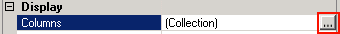
| Table columns. To open the dialog,
click the button
:
 |
| Determines whether the control reacts to user interaction. |
| Font of the control. |
| Foreground color of the control. |
| Display name of the control. |
| Determines whether the control and its subordinate controls are displayed. |
|
| The name of the control. Read only. |
|
| Determines how the size of the control is changed automatically whenever the size or position of its parent control is changed. |
| Coordinates of the top left corner in the container. |
| The position of the control in the tab order. |
| Size of the control (width; height). |
: Displays an image. (Information
about its settings.)
|
| Determines whether the control reacts to user interaction. |
| Font of the control. |
| Foreground color of the control. |
| Display name of the control. |
| The minimum padding between the
field and the edge of the viewer (in pixels). The greater
the padding, the larger the visible area of the image.
Note: This property
is only available when
is set to . |
| |
| Determines whether the control and its subordinate controls are displayed. |
| Zoom factor of the image. For
example, if the value is set to 0.5, the image is zoomed
to 50%. |
| : Uses a
fixed zoom factor when displaying an image in the
viewer. : Resizes
the image to fit within the viewer, and the aspect
ratio is preserved. : Resizes
the image to fit the image width within the viewer. : Resizes
the image to fit the image height within the viewer.
|
|
| The name of the control. Read only. |
|
| Determines how the size of the control is changed automatically whenever the size or position of its parent control is changed. |
| Coordinates of the top left corner in the container. |
| The position of the control in the tab order. |
| Size of the control (width; height). |
: Displays descriptive
texts. (Information
about its settings.)
|
| Background color of the control. |
| Determines whether the control reacts to user interaction. |
| Font of the control. |
| Foreground color of the control. |
| Display name of the control. |
| How to align the text. |
| Determines whether the control and its subordinate controls are displayed. |
|
| The name of the control. Read only. |
|
| Determines how the size of the control is changed automatically whenever the size or position of its parent control is changed. |
| Coordinates of the top left corner in the container. |
| The position of the control in the tab order. |
| Size of the control (width; height). |
: Displays a message
to users. (Information
about its settings.)
|
| Background color of the control. |
| Determines whether the control reacts to user interaction. |
| Font of the control. |
| Foreground color of the control. |
| Display name of the control. |
| How to align the text. |
| Determines whether the control and its subordinate controls are displayed. |
|
| The name of the control. Read only. |
|
| Determines how the size of the control is changed automatically whenever the size or position of its parent control is changed. |
| Coordinates of the top left corner in the container. |
| The position of the control in the tab order. |
| Size of the control (width; height). |
: Used for entering
all data on a fixed location on the form. :
In-place editors do not work together with tables. (Information
about its settings.)
|
| Determines whether the control reacts to user interaction. |
| Font of the control. |
| Foreground color of the control. |
| Display name of the control. |
| Determines whether the control and its subordinate controls are displayed. |
|
| The name of the control. Read only. |
|
| Determines how the size of the control is changed automatically whenever the size or position of its parent control is changed. |
| Coordinates of the top left corner in the container. |
| The position of the control in the tab order. |
| Size of the control (width; height). |
: Allows users to type
text or select from a list of values. The list of values can be entered
manually, or it can be supplied by a or a master data query. This makes it possible to create dynamic, dependent combo
boxes. (Information
about its settings.)
|
| Determines whether operators are permitted to select
> during Verification.
Tip: You can configure this
property for multiple fields at once by selecting
> .
|
| Defines the list of values for
the combo box. If <Values> is selected as the initial value,
enter the list of values manually under .
Alternatively, you can select a registered business rule
to supply a list of values. (Only business rules that return a list of values are
displayed.) Alternatively, you can select a master data query that supplies a list of values. Master data queries can be displayed multiple times
– once for each column that is set as
visible (by selecting
as a column setting in the dialog).
In other words, you assign a specific result column to
the combo box. When a Verification operator selects an entry in the combo box, all of the fields with selected in the dialog are populated with the values of the selected row. See Transferring master data to XBOUND fields.
|
| Assigned XBOUND field. (Adjust this first.) |
| Limits data input to the list
of values. If is
set, arbitrary text can be entered. |
| List of values for the combo
box if no is
selected. |
|
| Determines whether the control reacts to user interaction. |
| Font of the control. |
| Foreground color of the control. |
| Display name of the control. |
| Determines whether the control and its subordinate controls are displayed. |
|
| The name of the control. Read only. |
|
| Determines how the size of the control is changed automatically whenever the size or position of its parent control is changed. |
| Coordinates of the top left corner in the container. |
| The position of the control in the tab order. |
| Size of the control (width; height). |
: Allows users to
select text from a list of values. The list of values is assigned
manually. (Information
about its settings.)
|
| Determines whether operators are permitted to select
> during Verification.
Tip: You can configure this
property for multiple fields at once by selecting
> .
|
| Assigned XBOUND field. (Adjust this first.) |
| List of values. |
|
| Determines whether the control reacts to user interaction. |
| Font of the control. |
| Foreground color of the control. |
| Display name of the control. |
| Determines whether the control and its subordinate controls are displayed. |
|
| The name of the control. Read only. |
|
| Determines how the size of the control is changed automatically whenever the size or position of its parent control is changed. |
| Coordinates of the top left corner in the container. |
| The position of the control in the tab order. |
| Size of the control (width; height). |
: Allows users to execute a . (Information about its settings.)
|
| The custom action that clicking the button is to execute. The display name () of the button and the keyboard shortcut (if any) defined for the custom action are displayed on the button – in Verification, as well. |
|
| Determines whether the control reacts to user interaction. Note: If the button is deactivated or hidden, the custom action is also deactivated in the menu. |
| Font of the control. |
| Foreground color of the control. |
| Display name of the control. |
| Determines whether the control and its subordinate controls are displayed. Note: If the button is deactivated or hidden, the custom action is also deactivated in the menu. |
|
| The name of the control. Read only. |
|
| Determines how the size of the control is changed automatically whenever the size or position of its parent control is changed. |
| Coordinates of the top left corner in the container. |
| The position of the control in the tab order. |
| Size of the control (width; height). |
Design pane
The pane is used to design the
form. All
that were created for the form are displayed. If more than one panel exists,
each panel is displayed in a separate tab.
Here you can:
Controls can be selected by clicking them. Multiple controls can be
selected at once by holding the key
while clicking. You can also select controls by selecting an area with
your mouse. If you want to select all controls, click the button ( ).
).
If more than one control is selected, only properties common to all
selected controls are displayed. If such a property is changed, the change
is applied to all selected controls.
Pressing the key triggers the direct
entry mode. In this mode, you can directly assign the controls to XBOUND
fields or tables.
Tip: Rearrange form panels by
dragging and dropping the tabs.
Properties pane
In the pane, the properties
of the selected control(s) are displayed. For example, you can change the position, font, or XBOUND field assignment of a control.
If more than one control is selected, only properties common to all
selected controls are displayed. If such a property is changed, the change
is applied to all selected controls.
Tip: At the top of the pane there is a drop-down list
that contains all controls of the current panel, as well as the panel
itself. You can use it to access controls on the panel or to find controls
that are outside the viewable area of the panel.
Related topics
Creating a
form
Input forms for use in Verification: Overview
Transferring master data to XBOUND fields