Freetext Tool panel
Select one or more annotation, markup, or drawing object with the Hand tool or Select tool to activate the Freetext Tool panel. This tab offers the settings also found in object properties dialog boxes. To see how to handle object settings in properties dialog boxes, see Annotation and Markup Object Properties.
Font group
Provides basic controls for font settings of the selected text. See Font Group for details.
This group is active with the following kind of objects:
-
Text Box
-
Callout
Paragraph group
Provides controls for alignment settings of the selected paragraph(s). See Paragraph Group for details.
This group is active with the following kind of objects:
-
Text Box
-
Callout
Color Style group
Provides controls for color settings of the selected object(s). The group consists of various tools, displaying only the ones applicable to the selected kind of object(s).
-
Color Style – Select from the predefined border and/or fill color combinations. Border and fill colors can be adjusted separately with the Color and Fill Color tools detailed below.

- Color: Represents the border color of the object. Click the arrow to drop down the color palette with theme colors and standard colors.
-
Fill Color: Represents the fill (background) color of the object. Click the arrow to drop down the color palette with theme colors and standard colors.
This group is active with the following kind of objects:
-
Text box
-
Callout
-
Highlight
-
Highlight Area
-
Cross-out
-
Underline
-
Line
-
Arrow
-
Rectangle
-
Oval
-
Polygon
-
Pencil
-
Polygon Line
-
Cloud
Shape Style group
Provides controls for line style and opacity settings of the selected object(s). The group consists of various tools, displaying only the ones applicable to the selected kind of object(s). For Note objects, the title changes to Note Tool.
-
Icon Type (for Note objects only): Click the arrow to drop down the list of available icons, and then select one.
-
Color: Represents the line color of the object. Click the arrow to drop down the color palette with theme colors and standard colors.
-
Line Width: Click the arrow to drop down the list of line widths (1-12 pt), and then select one.
-
Dash Type: Click the arrow to drop down the list of line stye (such as dashed, dotted) and then select one.

-
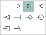
Start of Line: Click the arrow to drop down the list of arrowheads, and then select one for the starting point of the line.

-
End of Line: Click the arrow to drop down the list of arrowheads, and then select one for the terminating point of the line.
-
Opacity: Adjust the slider to change the opacity of the selected object(s).
-
Move the slider to the left (-) to turn the object less opaque (more transparent).
-
Move the slider to the right (+) to make it more opaque (less transparent).
-
This group is active with the following kind of objects:
-
Note
-
Text box
-
Callout
-
Highlight Area
-
Cross-out
-
Underline
-
Line
-
Arrow
-
Rectangle
-
Oval
-
Polygon
-
Pencil
-
Polygon Line
-
Cloud
Set group
-
Set as Default: Click to save the current text and object settings as default. A confirmation message displays.
-
All settings currently accessible on the Comment Format ribbon will be used as default.
-
Object Color, Fill Color, Line Width, Dash Type and opacity defaults are handled separately for object types. For example, a new Text box may look different, than a new Callout.
-
Font and paragraph settings defaults are handled globally. Changing the default font settings for a Callout results in the same font appearing in a newly created Text Box.
-
-
Text Box
-
Callout