Create charts
In a previous exercise, you learned how to create grids on metric data. In this example, you will see how to present the same data in chart format.
Charts provide a graphic representation of your data. In Insight, many chart types are available, and they can be converted to some other chart types. Charts are built mostly on metrics with the exception of scatter charts.
- Create a new View and name it Charts. Click OK.
-
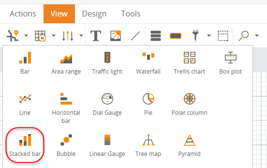
Drag a stacked bar chart to the canvas.
-
Configure the wizard.
-
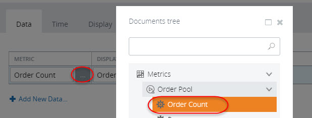
On the
Data tab, select the
Count
Orders value from the
Order Pool
metric.
- On the Time tab, select Fixed time window from 1/1/1900 12:00 AM to 1/1/3000 12:00 AM.
- On the Display tab, under Axis and drill down, set X-axis to Year, and Drill down dimension to Delivery Status.
- Click OK.
-
On the
Data tab, select the
Count
Orders value from the
Order Pool
metric.
-
Save
 the View, and open it in
the Preview/Viewer.
the View, and open it in
the Preview/Viewer.
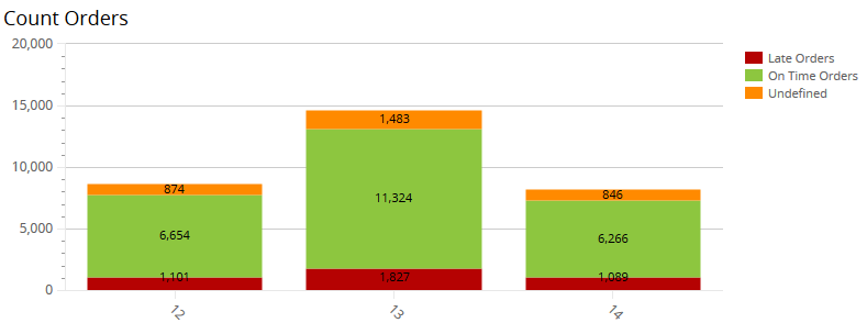
In this chart, you can see the number of orders for each year broken down by delivery status.
Create an advanced chart
Now we can modify the chart to make it more advanced: with several metrics and different configurations of the series. In Insight, it is possible to show different graphical types in a single component.
- Copy the stacked bar chart created above: right-click the component and select Copy. Then right-click an empty space on the canvas and select Paste.
-
Configure the wizard.
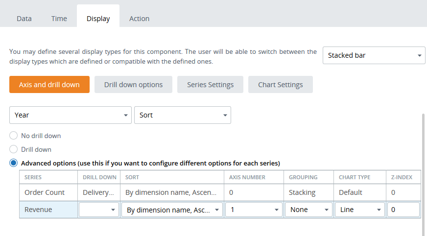
- On the Data tab, click Add New Data and select the Revenue metric.
- On the Display tab, select Advanced options and configure the axis: for the Revenue metric, set the axis to 1. Remove the drill-down setting for this series: select a blank option from the drop-down list. Set the chart type for the Revenue to Line.
-
Set
Grouping to
None for the
Revenue series.
- Click OK to close the wizard.
-
Save
the View and open it in
the Preview/Viewer.
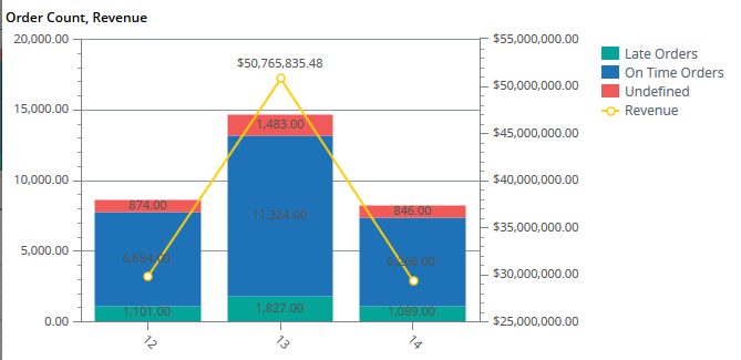
In this chart, the values for Order Count are relatively small compared to Revenue and therefore are almost illegible. To observe the trend of this metric rather than the absolute values, we assigned it to another axis.
After completing this exercise, you can see a chart where the two metrics are represented visually in a different manner and provide all the required information.